1. Introduction
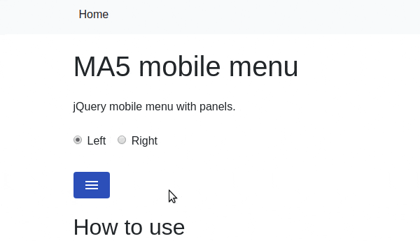
ma5-mobile-menu is a lightweight jQuery plugin for creating a mobile-friendly menu. The plugin has nice sliding forward and back animations and comes with many features like IE11 compatibility, HTML5, left or right side option, 9kB minified script size and many more.
2. Plugin Overview
| Library | ma5-mobile-menu |
| Author | MA5 |
| Licence | MIT Licence |
| Repository | GitHub |
| Dependencies | jQuery 3.3.1 or Later |
3. How to install and use ma5-mobile-menu jQuery plugin
Follow the below steps to install ma5-mobile-menu jQuery plugin on your website.
3.1. Load the jQuery library and ma5-mobile-menu asset files:
<!-- jQuery -->
<script src="https://code.jquery.com/jquery-3.3.1.min.js"></script>

<!-- ma5menu CSS -->
<link rel="stylesheet" href="css/ma5-menu.min.css">

<!-- ma5menu JS -->
<script src="js/ma5-menu.min.js"></script>
3.2. Create a button element that will be used to toggle the menu:
<button class="ma5menu__toggle" type="button">
    <span class="ma5menu__icon-toggle"></span> <span class="ma5menu__sr-only">Menu</span>
</button>
3.3. Create HTML structure for menu:
<ul class="site-menu">
            <li>
                <a href="index-page.html">Shop</a>
                <ul>
                    <li><a href="index-page.html">Products</a></li>
                    <li>
                        <a href="index-page.html">Collections</a>
                        <ul>
                            <li><a href="index-page.html">Premium</a></li>
                            <li><a href="index-page.html">Common</a></li>
                            <li>
                                <a href="index-page.html">Exclusive</a>
                                <ul>
                                    <li><a href="index-page.html">First</a></li>
                                    <li><a href="index-page.html">Secound</a></li>
                                </ul>
                            </li>
                            <li><a href="index-page.html">Other</a></li>
                        </ul>
                    </li>
                    <li>
                        <a href="index-page.html">Accesories</a>
                        <ul>
                            <li><a href="index-page.html">Small</a></li>
                            <li><a href="index-page.html">Medium</a></li>
                            <li><a href="index-page.html">Large</a></li>
                        </ul>
                    </li>
                    <li><a href="index-page.html">Cards</a></li>
                    <li>
                        <a href="index-page.html">Sets</a>
                        <ul>
                            <li><a href="index-page.html">Example 1</a></li>
                            <li><a href="index-page.html">Example 2</a></li>
                            <li><a href="index-page.html">Example 3</a></li>
                            <li class="active"><a href="index-page.html"><b>Example 4</b></a></li>
                            <li><a href="index-page.html">Example 5</a></li>
                        </ul>
                    </li>
                </ul>
            </li>
            <li>
                <a href="index-page.html">Lookbook</a>
                <ul>
                    <li><a href="index-page.html">For business</a></li>
                    <li><a href="index-page.html">Premium Area</a></li>
                </ul>
            </li>
            <li>
                <a href="index-page.html">Campaigns</a>
                <ul>
                    <li>
                        <a href="index-page.html">Summer 2019</a>
                        <ul>
                            <li><a href="index-page.html">Winter 2018</a></li>
                            <li><a href="index-page.html">Spring 2017</a></li>
                        </ul>

                    </li>
                </ul>
            </li>
            <li>
                <a href="index-page.html">Brand</a>
                <ul>
                    <li><a href="index-page.html">About us</a></li>
                    <li><a href="index-page.html">Press</a></li>
                </ul>
            </li>
            <li><a href="index-page.html">Contact</a></li>
        </ul>
        <div id="ma5menu-tools" class="ma5menu__tools">
            footer <a href="index-page.html">content</a> here
        </div>
3.4. Initialize the script in document.ready function:
$(document).ready(function () {
     ma5menu({
             menu: '.site-menu',
             activeClass: 'active',
             footer: '#ma5menu-tools',
             position: 'left',
             closeOnBodyClick: true
           });
});
After initialization, the button will handle opening and closing the menu.
4. Conclusion
In this article, we presented ma5-mobile-menu jQuery plugin that let you create mobile friendly menus. This plugin was designed with small devices in mind. It has a fully responsive design that looks and works great on mobile phones.
{{ 'Comments (%count%)' | trans {count:count} }}
{{ 'Comments are closed.' | trans }}