1. Introduction
Responsive-Lightbox is a lightweight jQuery library designated for creating a responsive gallery panels. The plugin automatically shrinks the image to the width & height of the browser. It was designed to showcase images only, without additional functionality to present other media files. This means the plugin is super small (3.39 KB min version) and does what it should perfectly.
2. Plugin Overview
| Library | Responsive-Lightbox |
| Author | Duncan McDougall |
| Licence | MIT Licence |
| Repository | GitHub |
| Dependencies | jQuery 1.9.1 or Latest version |
3. How to install and use Responsive-Lightbox jQuery plugin
In order to install Responsive-Lightbox jQuery plugin, follow below steps.
1. Load jQuery and Responsive-Lightbox assets (CSS styles and JS files) into your website:
<!--jQuery-->
<script src="https://ajax.googleapis.com/ajax/libs/jquery/1.9.1/jquery.min.js"></script>

<!--Lightbox Js-->
<script src="assets/js/jquery.lightbox.js"></script>

<!--Lightbox CSS-->
<link rel="stylesheet" href="assets/css/jquery.lightbox.css">
2. Create your gallery with the following HTML structure:
<ul class="gallery">
<li>
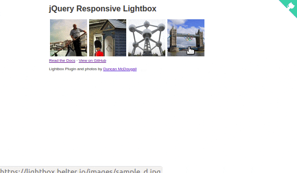
<a href="/sample_a.jpg"><img src="/sample_a_thumb.jpg" alt="Grand Canal near Rialto Bridge" /></a>
</li>
<li>
<a href="/sample_b.jpg"><img src="/sample_b_thumb.jpg" alt="Queen's Guard" /></a>
</li>
<li>
<a href="/sample_c.jpg"><img src="/sample_c_thumb.jpg" alt="Atomium, Brussels" /></a>
</li>
<li>
<a href="/sample_d.jpg"><img src="/sample_d_thumb.jpg" alt="Tower Bridge during the Olympics" /></a>
</li>
</ul>
3. Initialize Responsive-Lightbox in jQuery document ready function:
$(document).ready(function() {
    $('.gallery a').lightbox();
});
Responsive-Lightbox plugin after initialization will create a lightbox-like gallery with buttons to display next/previous image.
4. Conclusion
In this article, we showcased Responsive-Lightbox jQuery plugin created for image gallery. The plugin is perfect for web designers who want to present their work on portfolio websites. It can be useful also in e-commerce websites to showcase product photos.
{{ 'Comments (%count%)' | trans {count:count} }}
{{ 'Comments are closed.' | trans }}